Psychology in Design
Psychology Principles: The Ultimate Five

Good design is much less noticeable than bad design. One of the reasons is that good design fits our needs so well that the design itself serves us without being visible or drawing attention. Bad design, on the other hand, highlights its shortcomings and is noticeable. As designers, we can use psychology to create more intuitive and human-centred products and experiences. Rather than forcing users to follow the design of a product or experience, we can use some key principles of psychology as a guide to design who people are.
PSYCHOLOGY PRINCIPLES: THE ULTIMATE FIVE
1. MENTAL MODEL
A mental model is an explanation of someone's thought process about how something works in the real world. The user is satisfied as long as the process is performed in accordance with their expectations.They will start to make mistakes and lose their cool the moment it deviates from their expectations.
For instance, when you wake up in the morning and the first thing you do is take a brush, apply the toothpaste and brush your teeth. What if your brush doesn't have bristles and you can’t brush your teeth or the toothpaste is not there at the desired place. This will break down the mental model and leave you confused.
Everyone knows that on the top left corner of your website or chrome tab is a left arrow that indicates the ‘back’ (<-) option. The mental model would be broken when a user would find no back option or a right arrow instead. Similarly, both Android or IOS phones have a settings option which helps you to customize it your way but when there is no such option available it breaks down the mental model and either frustrates the user or confuses them.

2. FEEDBACK LOOPS
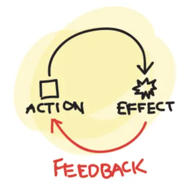
Feedback loops are processes where designers use systems output as input to find cause-and-effect relationships within it. In simple words, the feedback loop is the outcome a user gets at the end of a process. And this outcome should inform:-
- Recognition of a specific action or behaviour.
- Identify the impact of the action or behaviour.
- Set expectations for future actions or behaviours.

There are two types of feedback loops: positive and negative.
For instance, you switch on the light, it switches on and then you switch off the light and it switches off. This is the case of a positive feedback loop. What if you switch the light on but it doesn’t turn on? Now, this is the case of a negative feedback loop. Likewise, if you make a phone call to your friend but it doesn’t connect due to network issues then this is a case of negative feedback and if that call allows you to talk to your friend then that’s a positive feedback loop.

A solution to this problem is to keep confirmation screens or pop-ups. We all know a similar example of Google Forms. There’s always a message after submission,” Thank you for your feedback” on submitting successfully and a message “You need permission” when you are not able to submit.
3. VON-RESTORFF EFFECT
According to this principle, when multiple similar objects are present, the one that differs from the rest is most likely to be remembered. This effect is also called the Isolation effect. Let’s say when you study from a book you highlight important keywords that you are most likely to remember from other texts.
Similarly, while designing an application or a website, the CTA (Call to Action: a visual prompt that tells the user to take action) button is kept apart from other buttons or options.
4. SERIAL POSITION EFFECT
According to this principle, when people are given a list of items, they are more likely to remember the first few and the last few, while the items in the middle tend to blur. This effect is also called the Primary effect. For example, when you have verbally dictated the list of some grocery items you tend to remember only the first and last few items. Similarly, while designing an application or website, the most important user actions are kept in the top navigation bar and the CTA button is generally kept at the bottom. This makes the user pay attention to these actions.
5. HICK’S LAW
According to this principle, the more options a user has, the longer it takes for them to make a decision. In simple terms, more choices are directly proportional to the time taken. One of the best examples is a regular Television remote control has multiple buttons whereas Apple TV remote controls have only limited buttons. Refer to the image below.

CONCLUSION
The creative process may be greatly enhanced, user needs can be better understood, and designers can benefit from having a basic understanding of psychology in design. You’ve seen there are so many examples of design in our everyday life that have been built according to human psychology. From brushing your teeth in the morning to watching TV lying on your comfortable couch almost everything has been designed perfectly to fit user needs.
At the end, I would like to conclude
You don't need a PhD in Psychology to understand your user; simply be a good observer.
Explore More Insights
Ready to Transform Your Business?
Join industry leaders already scaling with our custom software solutions. Let’s build the tools your business needs to grow faster and stay ahead.